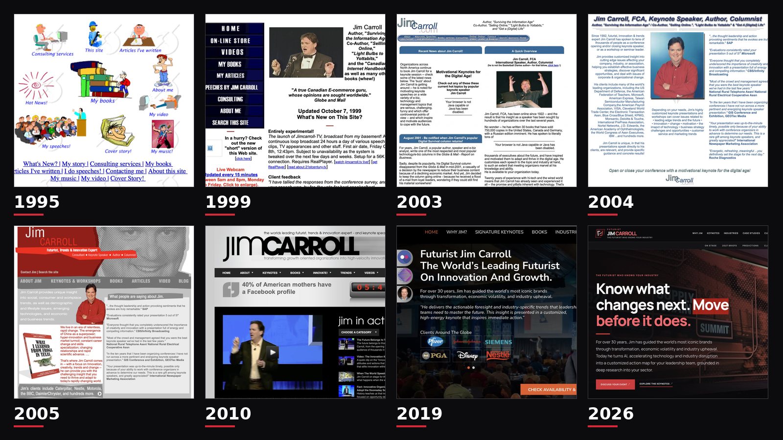
From cartoon clip art and a 56K modem to WordPress, EmDash and Astro: the rather remarkable evolution of JimCarroll.com.
I've just launched an entirely new version of JimCarroll.com.
By my count, it's the eighth major redesign of my website since 1995.
That's eight different versions of my digital identity. Eight attempts to figure out how best to present what I do. Eight snapshots of how technology, design, communication, and the Internet itself have changed.
And, looking back at some of the old screenshots, eight reminders that the Internet was once a very strange place.
I've spent more than three decades on stage telling organizations that they need to reinvent themselves to keep up with the future.
Apparently, I've been taking my own advice.
Well, at least when it comes to my website.
1995: Welcome to the World Wide Web!
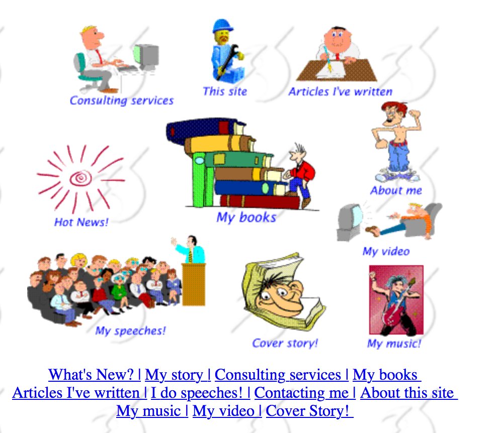
Look at that!
Cartoon characters! Colourful illustrations! A collection of clickable graphics! And a menu offering such exciting destinations as "My books," "My speeches," "My music," and "My video."
This was my website in 1995.
There was no Google. No Facebook. No YouTube. No WordPress. No social media. The idea of having your own website was still rather novel, and building one involved a fair bit of experimentation, patience, and occasionally some colourful language.
It was an era when simply having a website was something of an achievement.
You wrote HTML. You figured out how to arrange images. You uploaded everything to a server. You crossed your fingers. And then you excitedly told someone to go look at it.
The extraordinary thing, looking back, is that the basic idea was already there. I was writing books, delivering speeches, creating content, and trying to share ideas with a wider audience.
The technology was primitive.
The ambition wasn't.
And apparently, I thought cartoon clip art was an excellent way to communicate my expertise.
1999: A Bow Tie, a Webcam, and the Future of Broadcasting
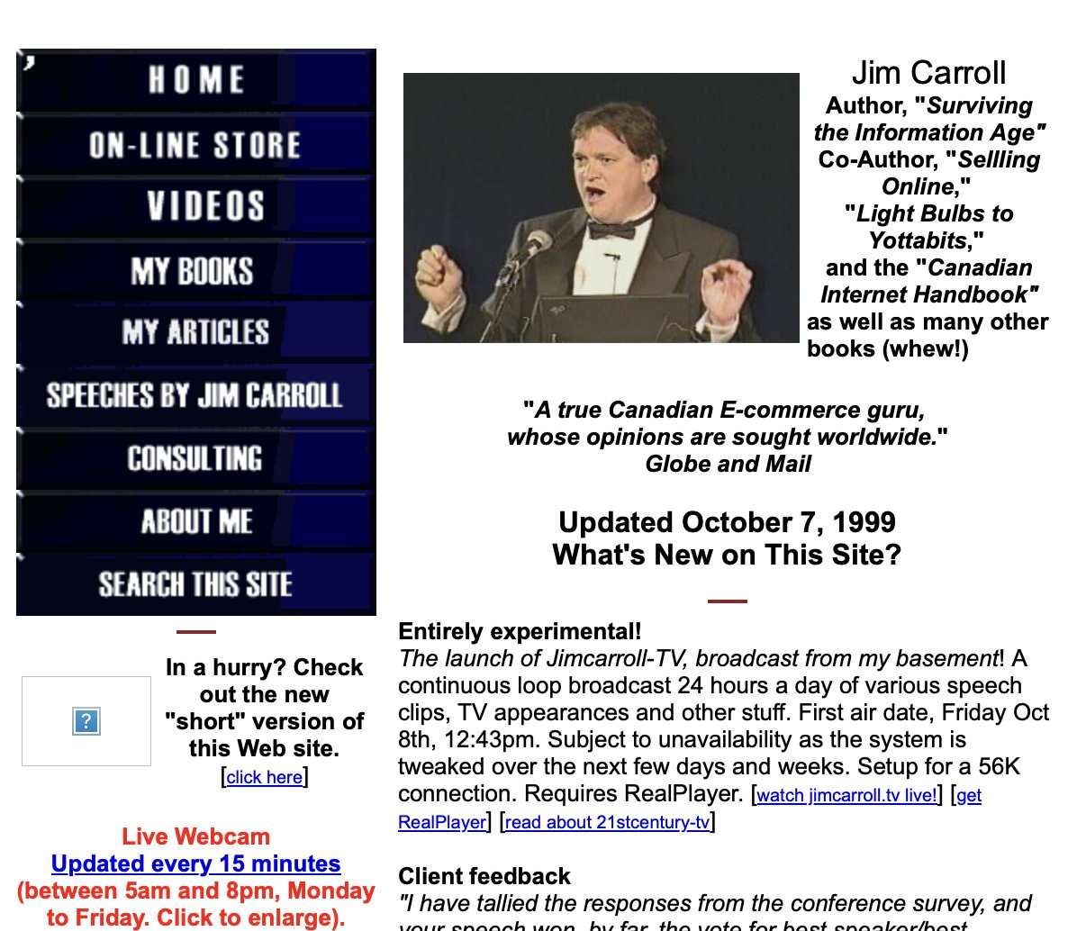
By 1999, things were getting serious.
I had a new website design, a considerably more formal photograph of myself wearing a bow tie, and something quite extraordinary.
My own Internet television channel.
Seriously.
In October 1999, I launched JimCarroll-TV, an experimental online broadcast originating from my basement. It featured a continuous loop of speech clips, television appearances, and other material.
The first scheduled broadcast was October 8, 1999, at precisely 12:43 p.m.
Why 12:43? I have absolutely no idea.
The website proudly explained that the service was designed for a 56K connection and required RealPlayer.
Remember RealPlayer?
Remember waiting for a video to buffer?
Remember when online video was something you had to explain to people?
I was experimenting with Internet broadcasting years before YouTube arrived. I also had a live webcam that updated every 15 minutes.
Why would anyone want a webcam pointed at my office?
An excellent question.
But at the time, we were all experimenting with what the Internet might become. The possibilities seemed limitless, even if our bandwidth wasn't.
That was the fun of it. Nobody really knew what would work.
We just kept trying things.
2003: The Great Blue Button Era
Ah, the early 2000s.
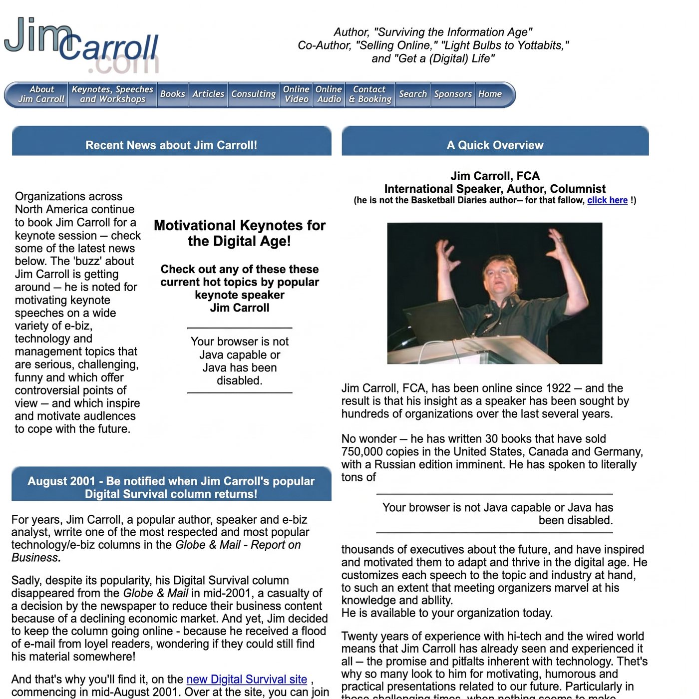
A wonderful period in web design when virtually every navigation menu needed to look like a collection of shiny three-dimensional buttons.
Mine certainly did.
By this point, the website had become a much more substantial operation. There were detailed sections on keynote speeches, articles, books, consulting, online video, and online audio.
I was no longer simply announcing that I existed on the Internet.
I was using it to demonstrate what I knew, share my ideas, and help organizations understand why they might want me on their stage.
The website also featured some wonderful artifacts of the period.
For example, prominent messages informed visitors that their browsers were not Java-capable or that Java had been disabled.
Today, that would be a fairly serious design problem.
Back then, it was apparently part of the experience.
And in one particularly impressive bit of accidental futurism, the site proudly announced that I had been online since 1922.
That's quite a head start.
I always did like to get ahead of trends.
2004: Getting Down to Business

By 2004, the Internet had become much more important to my speaking business.
The website reflected that.
The design became cleaner, with a stronger emphasis on my experience, the organizations I had worked with, and the feedback I was receiving from clients.
SAP. Microsoft. CBS/Infinity Broadcasting. Roche Diagnostics. And others.
The page was filled with testimonials, client names, and examples of the subjects I was covering.
Looking back, this was an important shift.
The website wasn't just a place to publish information anymore. It was becoming a way to demonstrate credibility and explain the value of a highly customized keynote presentation.
There was a lot of text.
A LOT of text.
Apparently, I hadn't yet discovered the concept of white space.
But the content mattered. Much of what differentiated my work then still defines it today: deep research, customized insight, practical ideas, and a willingness to challenge audiences to think differently about the future.
The design would change many more times.
That core approach would not.
2005: Red Arrives. And So Do the Frogs.

By 2005, things were starting to look a little more like the JimCarroll.com people would eventually recognize.
A bold red design. More prominent navigation. A stronger visual identity.
And, of course, a frog.
My book What I Learned From Frogs in Texas occupied a prominent position on the homepage.
There were references to emerging technologies, globalization, changing careers, new competitors, rapid scientific advances, and relentless innovation.
Sound familiar?
It's remarkable how many of those themes remain relevant today.
Some of the technologies have changed. The speed of disruption has certainly increased. But the underlying challenge facing organizations is much the same: understanding change, adapting to it, and finding opportunities in a world that refuses to stand still.
This was also the period when my website was evolving beyond the old model of an online brochure.
It was becoming a place to share a substantial collection of ideas about trends, innovation, leadership, and the future.
And red was becoming a permanent part of my visual identity.
Some things stick.
2010: Video, Social Media, and the Modern Internet
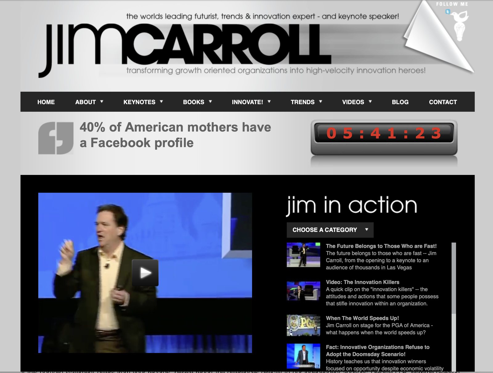
By 2010, the web was an entirely different place.
Social media had arrived. Video was becoming central to online communication. Websites were evolving from collections of pages into much richer experiences.
My homepage reflected all of that.
A dramatically different black-and-white visual identity. A giant Jim Carroll logo. A navigation bar with dropdown menus. A large embedded video player.
There was even a digital countdown clock.
And a prominent statistic informing visitors that 40% of American mothers had a Facebook profile.
The fact that such a statistic was considered remarkable tells you something about how much the world has changed.
Facebook was still relatively new. Twitter was emerging as a significant platform. YouTube had transformed online video. Smartphones were beginning to redefine how people consumed information.
Meanwhile, I was building an increasingly large library of keynote clips, interviews, articles, and commentary.
The website was no longer simply about telling people what I did.
It was about showing them.
By this stage, the Internet had become an essential part of my business, my research, and my ability to reach audiences worldwide.
And the amount of material I was publishing was growing rapidly.
Which created another problem.
How do you organize all of it?
That question would become increasingly important in the years ahead.
2019: The WordPress Years — Bigger, Bolder, More Visual

Eventually, WordPress became the backbone of my online publishing operation.
And the website continued to evolve.
By 2019, the design was substantially more sophisticated.
Large stage photography. Prominent client logos. Stronger calls to action. A much more visual presentation of my work as a global keynote speaker and futurist.
This was the version of JimCarroll.com that many people will probably remember.
It served me well for years, right up until its retirement in November 2026.
WordPress made it possible to publish an extraordinary amount of material. Articles, videos, books, keynote descriptions, trend observations, daily inspiration posts, industry research, and much more.
Over time, however, the site grew into something enormous.
Thousands of pieces of content.
Decades of accumulated ideas.
A vast library of material covering industries, technologies, business models, leadership challenges, and the future.
And the inevitable consequence of all that growth?
Complexity.
The website had become a remarkable archive of my thinking, but navigating and maintaining it was increasingly challenging.
It was time to rethink the whole thing.
Not just change the colours.
Not just rearrange the homepage.
Rethink what a website should actually be.
2026: A New Architecture for a New Era
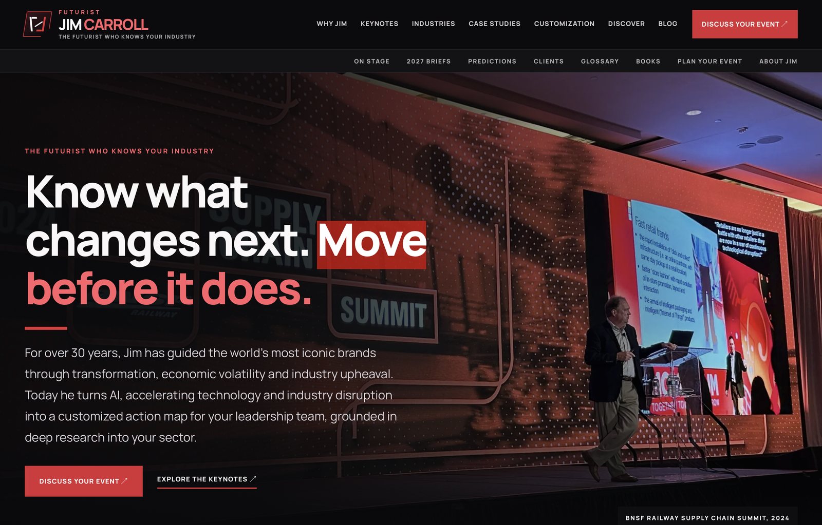
Which brings me to today.
The eighth major version of JimCarroll.com is now live.
And this one is different.
Very different.
I've moved away from the old WordPress approach and into a new world built around EmDash and Astro, with modern publishing tools, a redesigned information architecture, and a much more connected collection of content.
The new visual identity is unmistakably black, white, and red.
The homepage has a simple message:
Know what changes next. Move before it does.
That's a pretty good summary of what I've spent my career doing.
But the most important changes aren't necessarily the ones you see.
Behind the design is an effort to connect decades of writing, research, keynote presentations, client stories, books, trends, and ideas in ways that make them easier to discover and explore.
I've been building out an ecosystem of specialized websites, industry resources, book sites, and research collections.
The objective isn't simply to have a nice-looking homepage.
It's to make more than three decades of experience and insight accessible, relevant, and useful.
And, of course, there's something else that's changed dramatically.
Artificial intelligence.
The arrival of AI-assisted development tools has transformed what's possible when building websites. Projects that once required substantial teams, budgets, and development cycles can now be explored, prototyped, tested, and improved at an extraordinary pace.
I've been using these tools extensively in rebuilding my digital presence.
It's been fascinating.
It's also been a reminder that technology doesn't eliminate the need for judgment, creativity, experience, or a clear sense of purpose.
It just gives you new ways to apply them.
In many ways, that's the same message I've been sharing with organizations for decades.
Thirty-One Years Later, What Have I Learned?
Looking through these eight screenshots is a rather remarkable experience.
They're not just pictures of old websites.
They're a history of the Internet.
In those images, you can see the progression from hand-coded HTML and cartoon graphics to streaming media, sophisticated publishing systems, video-rich experiences, and modern web architectures.
You can see the evolution of technology.
You can see the evolution of design.
And you can see the evolution of my career, from an author and technology commentator exploring the early Internet to a futurist working with organizations around the world on the challenges of accelerating change.
But here's what really strikes me.
The fundamental purpose of my website hasn't changed very much at all.
Go back to that 1995 version.
There were links to my books, my articles, my speeches, and my consulting work.
Thirty-one years later?
I'm still writing books, publishing articles, delivering keynotes, and helping organizations understand what's next.
The tools have changed.
The reach has changed.
The opportunities have changed.
The speed of everything has changed.
But the basic mission has remained remarkably consistent.
And that might be the most interesting lesson of all.
Technology will keep changing. Platforms will come and go. Today's revolutionary tools will eventually look as quaint as those shiny blue navigation buttons from 2003.
The challenge isn't to chase every new technology.
It's to understand how to use it to do what matters, only better.
I've been doing that with my own website since 1995.
Eight major versions.
Thirty-one years.
Thousands of articles, countless experiments, an enormous amount of HTML, several generations of publishing technology, and at least one very questionable webcam.
And I'm still experimenting.
Because, really, what else would you expect from a futurist?
Welcome to JimCarroll.com, version 8.0.
I wonder what version 9 will look like.
And somewhere out there, I hope someone still has a working copy of RealPlayer.